
The brief
Passion Projects approached me after struggling to find the right balance for its new identity.
Previous thinking had centred around the idea of growing an idea — seeds developing into something larger and more established. It was a logical concept for a software development business, but visually it was proving difficult to communicate without the identity beginning to feel more suited to a garden centre, florist or environmental brand.
The company name presented another obvious route, but hearts and other expressions of “passion” quickly pushed the identity towards the visual language of dating apps.
The challenge was to find something distinctive that reflected the personality of the business without relying on either of those literal ideas.
The work
Rather than trying to illustrate what Passion Projects does, I suggested moving towards a more typographic identity — something playful enough to have character, but simple and flexible enough to work comfortably within the technology sector.
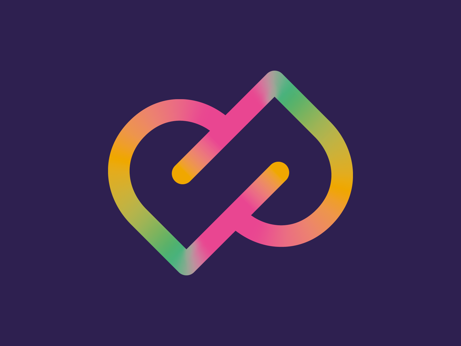
The solution grew from the two Ps in Passion Projects. By combining them into a single graphic device, we created a compact, recognisable motif that could work independently from the full name while still having a clear connection to it.
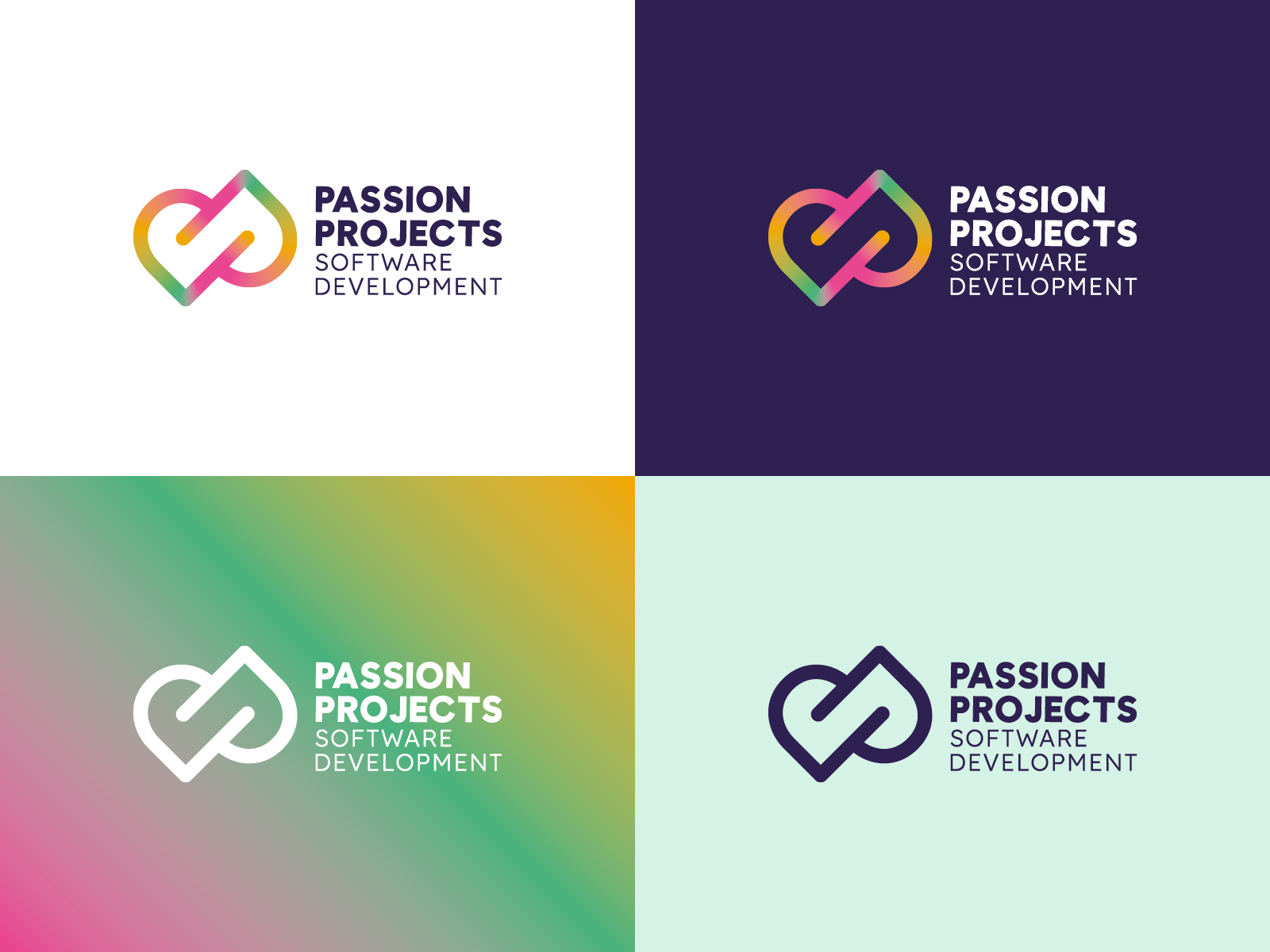
The double-P symbol is supported by clean typography, giving the identity a useful contrast between personality and clarity. A bright gradient palette brings energy to the mark and gives the brand room to feel modern and expressive without overwhelming the underlying system.
Importantly, the identity is not reliant on colour — the double-P motif remains clear and recognisable in a single-colour application, making it practical across a much wider range of uses.
The result is an identity that can flex from a full company logo to a simpler standalone symbol across digital applications, presentations, social media and other brand touchpoints.

The outcome
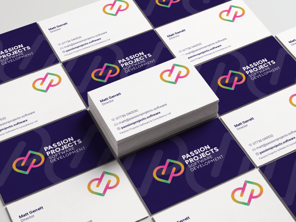
The finished identity gave Passion Projects the balance that had been missing from the earlier concepts.
By stepping away from literal imagery around seeds, growth and passion, the brand became much more clearly aligned with a modern software development business while retaining the individuality the client was looking for.
The double-P motif provides a memorable visual asset in its own right, while the cleaner typographic system gives the wider identity the flexibility to grow alongside the company.