
The brief
El Cerdo was a new tapas restaurant looking for an identity that could establish the business from day one.
Built around the social nature of Spanish tapas — sharing, bold flavours and informal dining — the brand needed to feel warm and distinctive without relying on familiar Spanish restaurant clichés.
The work
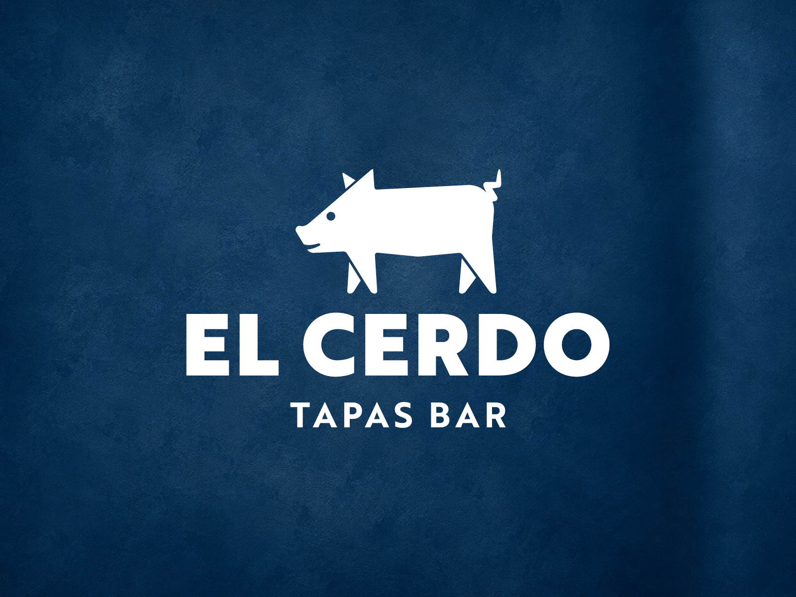
At the heart of the identity is a deliberately simple pig symbol — a direct reference to the name El Cerdo, meaning “The Pig” — paired with a bold, confident wordmark.
The mark was designed to be playful without becoming novelty-led, and simple enough to work across signage, uniforms, menus, print and digital applications.
A restrained palette and straightforward typography keep the wider identity clean, allowing the pig to become the recognisable visual anchor of the brand.
The outcome
The identity launched with El Cerdo’s first restaurant and has continued to work as the business has grown to locations in Maidenhead and Bourne End.
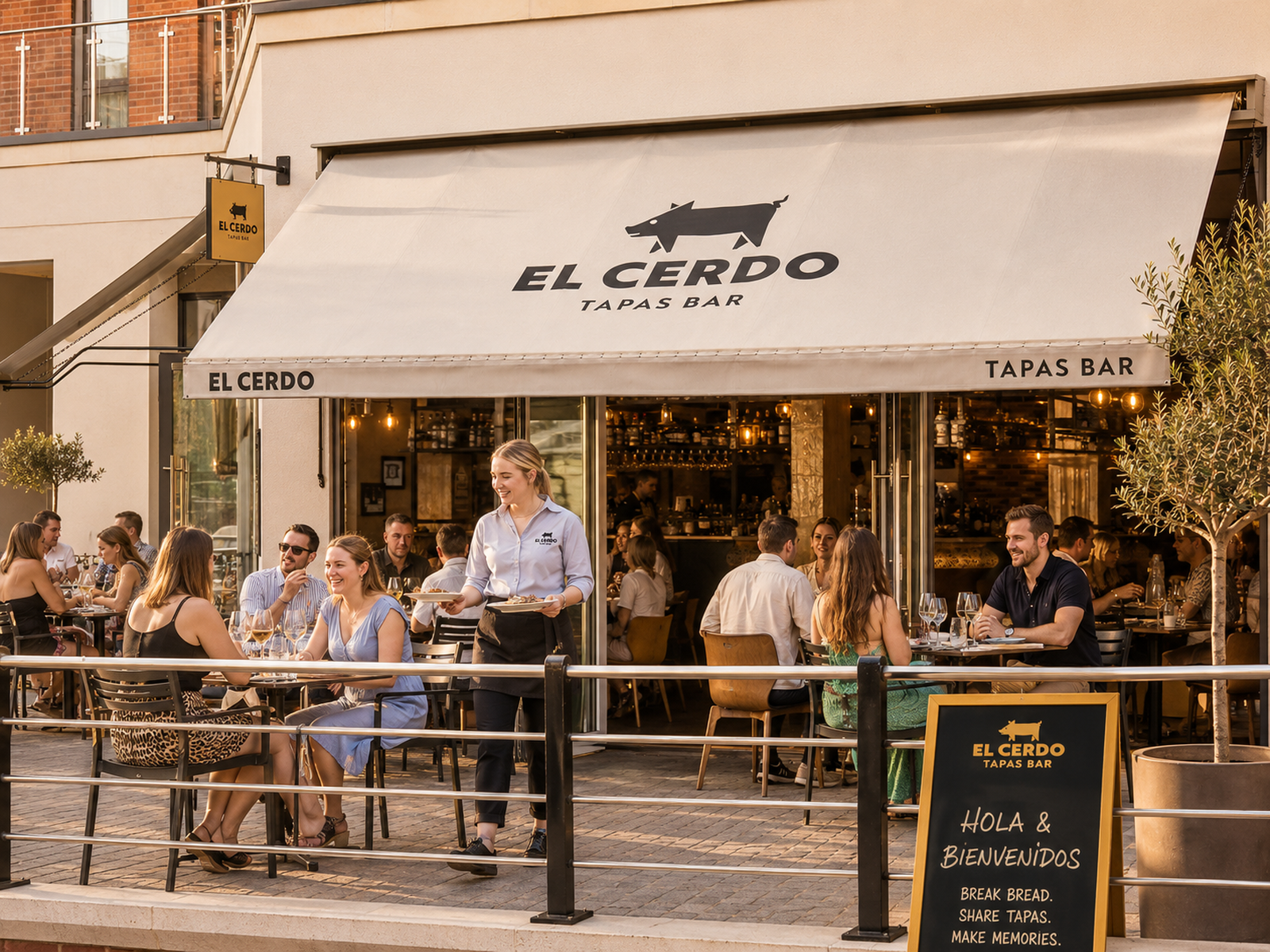
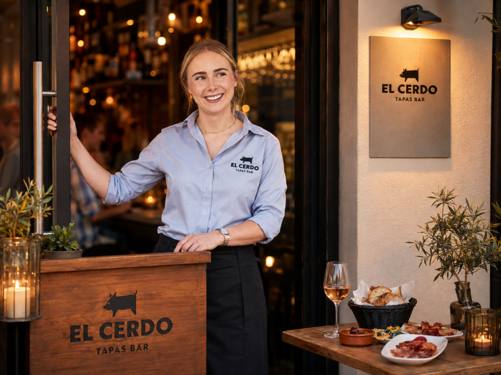
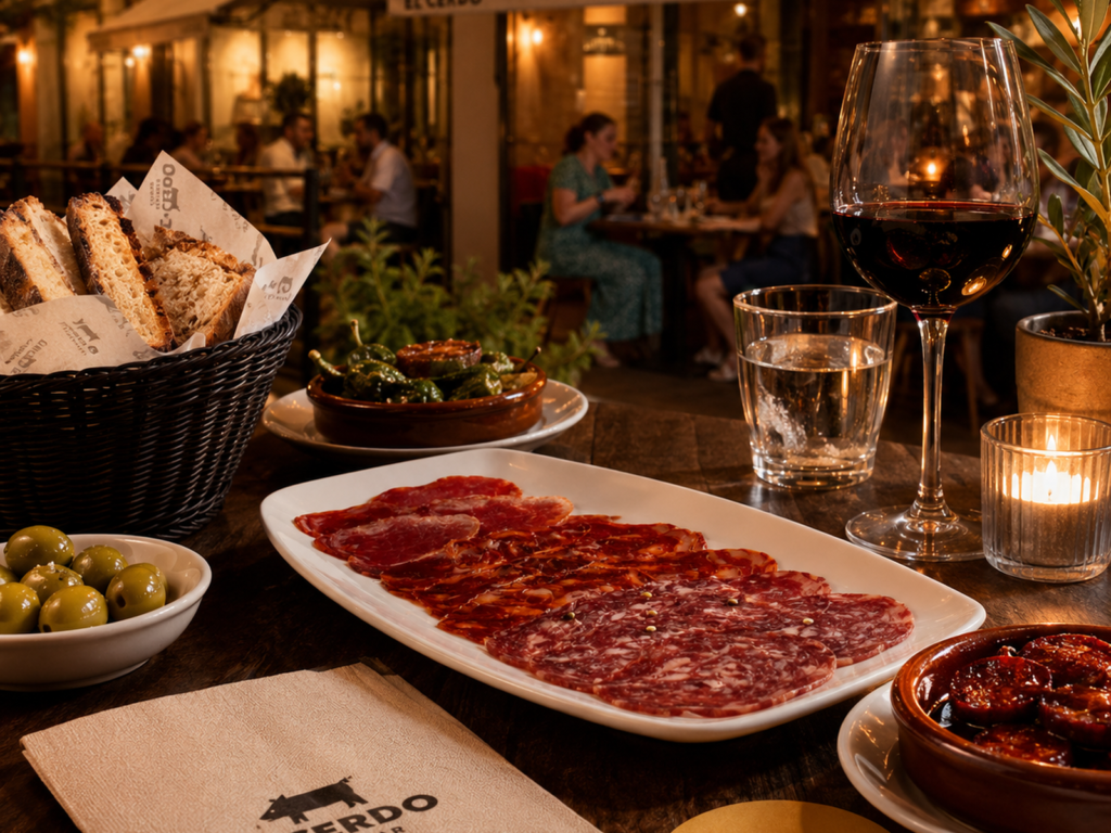
The pig has become a useful brand asset in its own right, appearing confidently across the restaurant frontage, staff clothing and customer-facing material.