
The brief
This was a speculative branding exercise for the Australian Croquet Association, exploring how the organisation could have a more distinctive, contemporary identity.
The challenge was to create something that immediately felt Australian and clearly referenced croquet, while remaining simple enough to work across everything from clothing and merchandise to signage and digital applications.

The work
The idea came down to three simple ingredients: Australia + Croquet + Association.
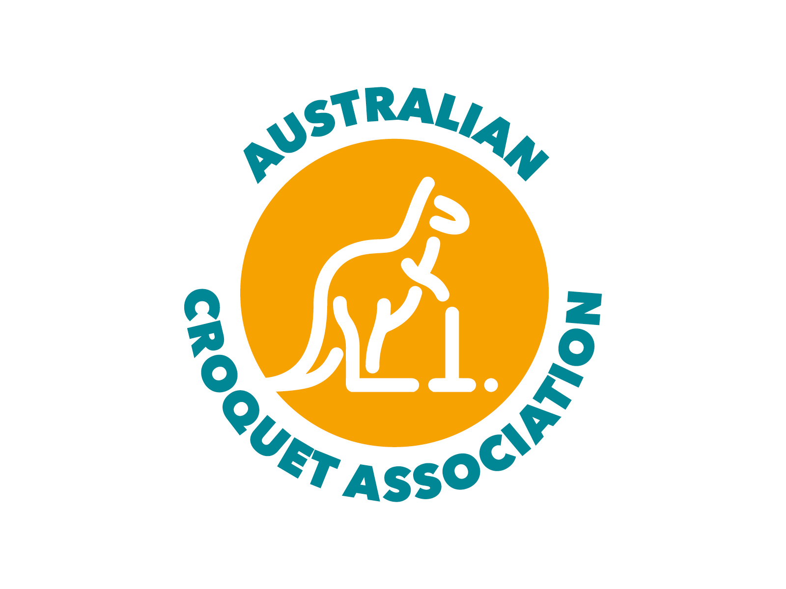
The kangaroo provides the immediate Australian connection, while the mallet and ball make the sport unmistakable. Rather than treating these as separate symbols, I worked them together into a single simplified line illustration, giving the kangaroo a sense of movement and bringing a little of croquet’s precision and finesse into the character.
A circular device brings everything together as a badge and gives the identity a sense of unity — appropriate for an association representing players and clubs across the country.
Negative space keeps the illustration clean and prevents the mark becoming overly detailed. That was important because the logo needed to remain recognisable at small sizes and work just as effectively in a single colour as it does in the full identity.
The green and gold palette reinforces the Australian connection, while the bold, simplified drawing style gives the identity a more contemporary feel.


The outcome
The result is a compact identity that communicates Australia, croquet and association without needing lots of additional explanation.
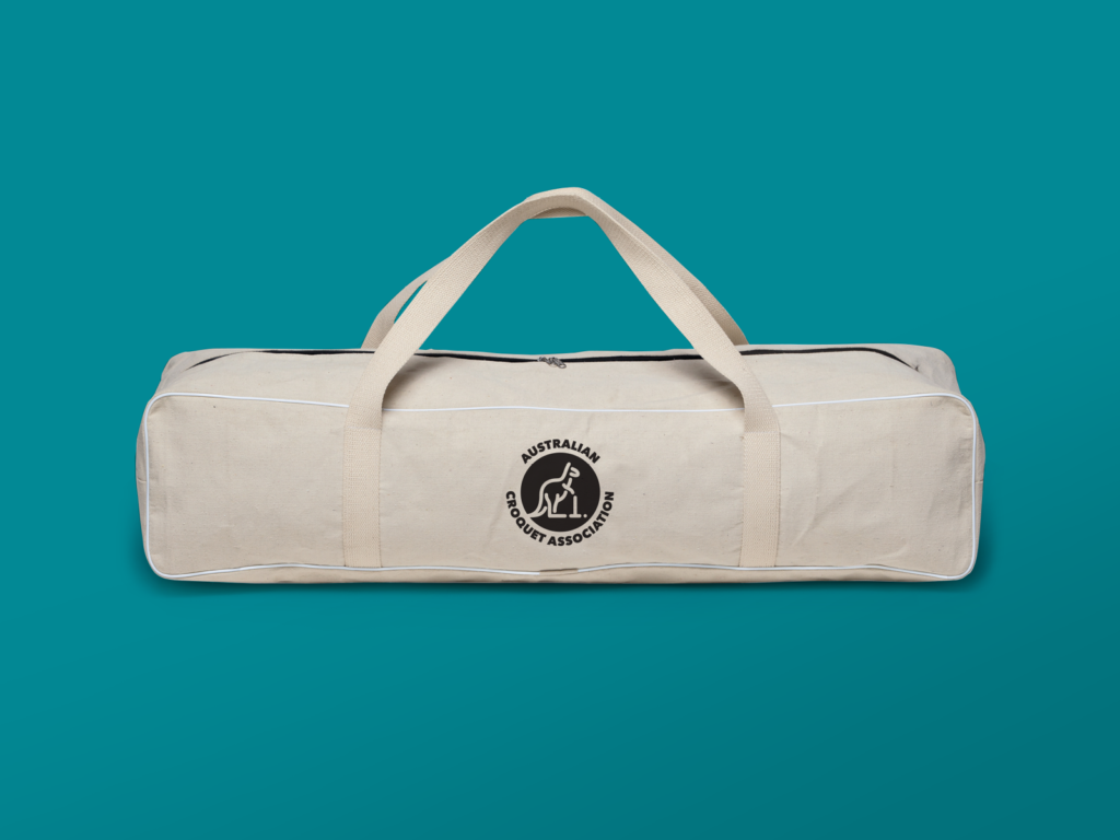
The kangaroo becomes the distinctive part of the system, while the circular badge makes the mark easy to apply across clothing, social media, printed material and event graphics.
As a speculative project, it was also a useful exercise in reducing a fairly broad brief down to a very simple visual equation — kangaroo + croquet + circle = ACA.