

The brief
Marks of Genius was created to support a major cultural initiative connected to Toby Blackwell’s (owner of Blackwell’s) personal donation to the Bodleian Library. The initial route was simply to add Blackwell’s name beneath the existing Marks of Genius logo, but that felt too slight for a project of this scale and significance. The opportunity called for something with more presence — an identity that reflected the importance of the donation, the world of rare books and the long-standing heritage of Blackwell’s.

The work
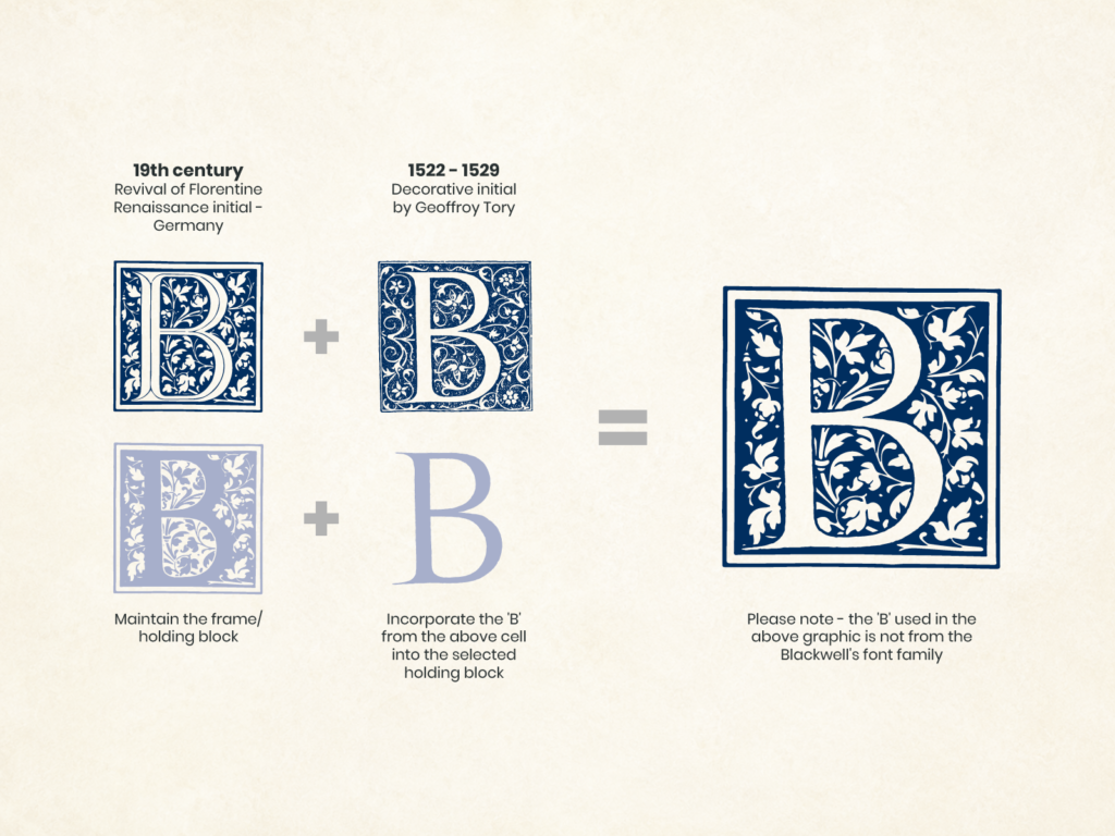
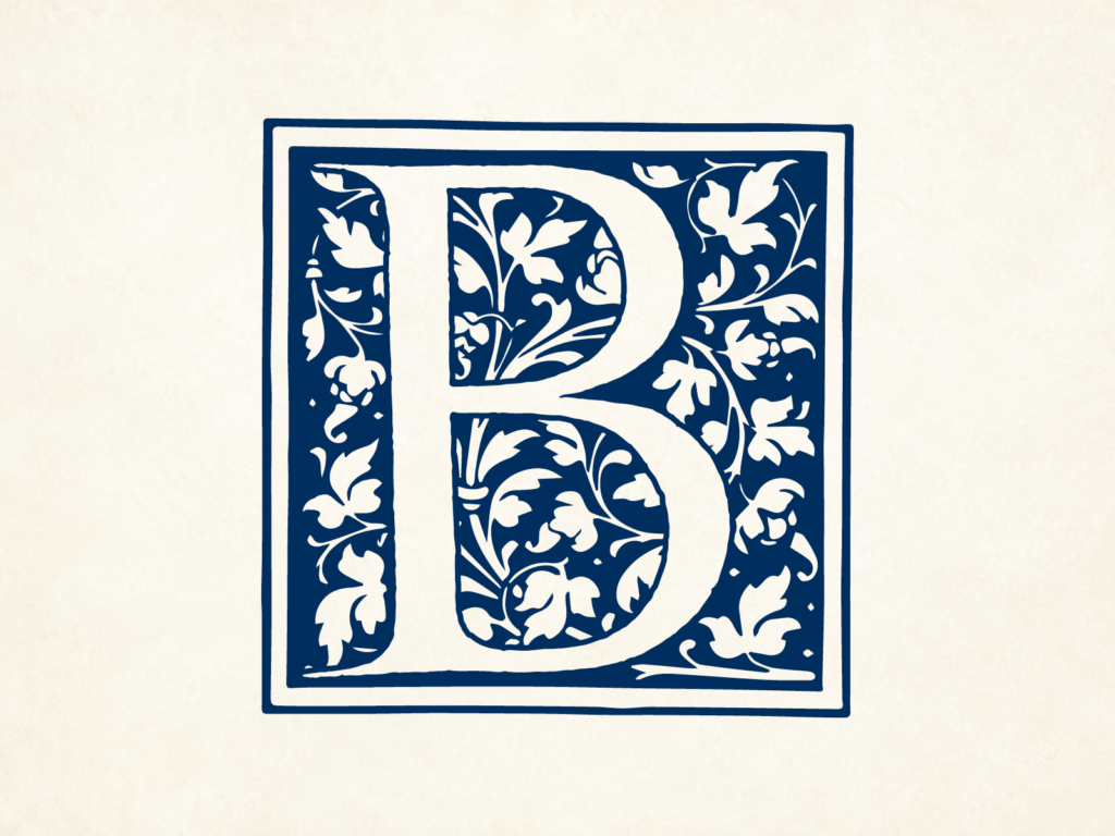
Rather than treating Blackwell’s as a secondary add-on, I developed a more distinctive identity centred around a decorative ‘B’ monogram. The idea drew on historical printing blocks and ornate initial letters, linking the mark to the traditions of bookmaking, scholarship and the history of the printed page.
This approach gave the campaign a stronger sense of character and authority, while still allowing the hierarchy to flex in-store. The full Marks of Genius at Blackwell’s lock-up could be used where clarity was needed, while the standalone ‘B’ motif provided a concise brand element for signage, display material and merchandise.
The result felt much more appropriate to the subject matter — rooted in literary heritage, visually memorable and clearly connected to Blackwell’s without relying on a simple name add-on.

The outcome
The finished identity gave Marks of Genius a more considered and enduring visual language. The decorative ‘B’ added depth, heritage and recognisability, helping the campaign feel more in keeping with the cultural weight of the project. Used throughout the store environment, the mark allowed Blackwell’s presence to come through clearly while supporting the wider campaign identity.
Importantly, the monogram proved strong enough to travel beyond the original project, later being adopted more widely in and around Blackwell’s stores and on merchandise. That gave the work a life beyond the campaign itself — always a good sign that the idea had genuine strength.