

The brief
I worked with Blackwell’s Bookshop across a number of campaigns and promotional projects, producing work for everything from children’s departments and young adult fiction to major national promotions.
The subject matter changed from brief to brief, so there was never really a single visual formula to follow. The challenge was to find an idea with enough character to capture people’s attention, while making sure the creative treatment was right for the books, the audience and Blackwell’s.
That freedom to approach each campaign differently was a big part of what made the work enjoyable.

The work
One of the largest projects was a nationwide campaign celebrating the 150th anniversary of Lewis Carroll’s Alice’s Adventures in Wonderland. I developed “Discover your own Wonderland”, combining expressive typography with the familiar White Rabbit illustration and a restrained cream, red and blue palette. The identity was designed to translate from in-store point of sale and digital material through to large-format outdoor advertising.
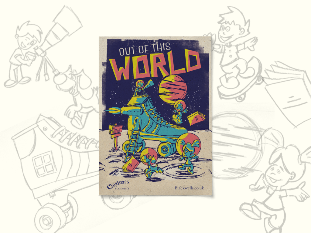
For Out of This World, created for Blackwell’s children’s departments, the direction changed completely. The brief called for something fun, colourful and adventurous, so I developed a deliberately retro, comic-book-inspired space scene. Familiar nursery-rhyme imagery was given an unexpected science-fiction twist, creating something playful enough for children but visually strong enough to work as a retail campaign.
Blackwell’s was also promoting witch-themed fiction to two very different audiences, which gave me the opportunity to approach essentially the same subject from opposite directions.
For the young adult campaign, the familiar pointy hats and broomsticks were deliberately avoided. “Hubble Bubble — You’re in Trouble” used stark monochrome imagery, expressive typography and a flock of birds breaking away from the lettering to create something darker, more atmospheric and closer to contemporary fantasy.
The accompanying children’s campaign needed to feel magical without becoming frightening or overly babyish. For “Hubble Bubble — Toil and Trouble”, I took inspiration from The Wizard of Oz, turning the image of the Wicked Witch beneath Dorothy’s house into a playful book-related illustration — a spell book with striped legs disappearing underneath it.
Across all of the campaigns, the approach was essentially the same: find the idea first, then build the visual language around it. Illustration, typography, photography and colour could change completely depending on what the particular brief required.

The outcome
The campaigns appeared across Blackwell’s stores, point of sale, digital channels and outdoor advertising, with the Wonderland work rolled out nationally and subsequently leading to a further campaign for the flagship Oxford store.
More importantly, the projects developed into an ongoing creative relationship. Blackwell’s regularly brought very different briefs to me, trusting me to find an individual visual response rather than simply applying an existing template.